Otis Shepard
Baseball’s Greatest Graphic Artist

If this were not a Wrigley Field program from 1962 it could be displayed at the Museum of Modern Art. It was one of the last Chicago Cubs programs designed by the incomparable Otis Shepard, a pioneering graphic artist who had worked with Philip K. Wrigley’s gum company and his ball club for thirty years.
Though trained in the painterly tradition of turn-of-the century illustrators and commercial graphic artists like Edward Penfield, J.C. Leyendecker, and Norman Rockwell, Shepard gravitated to more sleek, reductive forms — with ever increasing reliance upon the airbrush — after his marriage to fellow artist Dorothy Van Gorder in 1929. For many of Otis Shepard’s illustrations, his wife was an unsigned collaborator.
The success of Otis’s glowing ads for Wrigley Gum may have shaped his approach to promoting the Cubs, beginning in the 1930s.

Shepard’s designs did not appear on Cubs programs and scorecards until the 1940s but his style was plain on other assignments in the 1930s, including the redesign of the Cubs uniform.

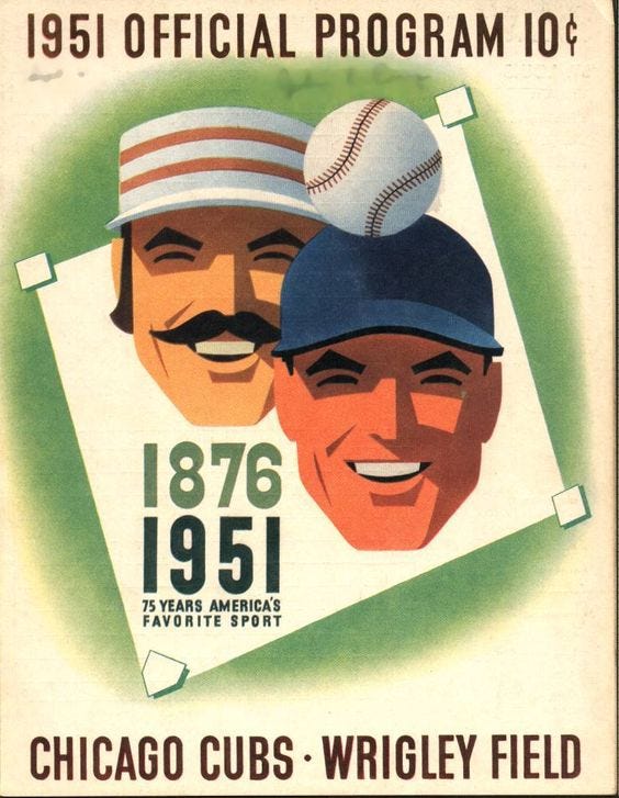
Shepard’s design of the 1951 75th anniversary sleeve patch for the Cubs was adopted by the National League and his reputation as the premier designer in baseball circles was cemented.

He designed uniforms, programs, and logos for the Chicago Cubs, and the logo and base uniform for the All American Girls Professional Baseball League (AAGPBL).
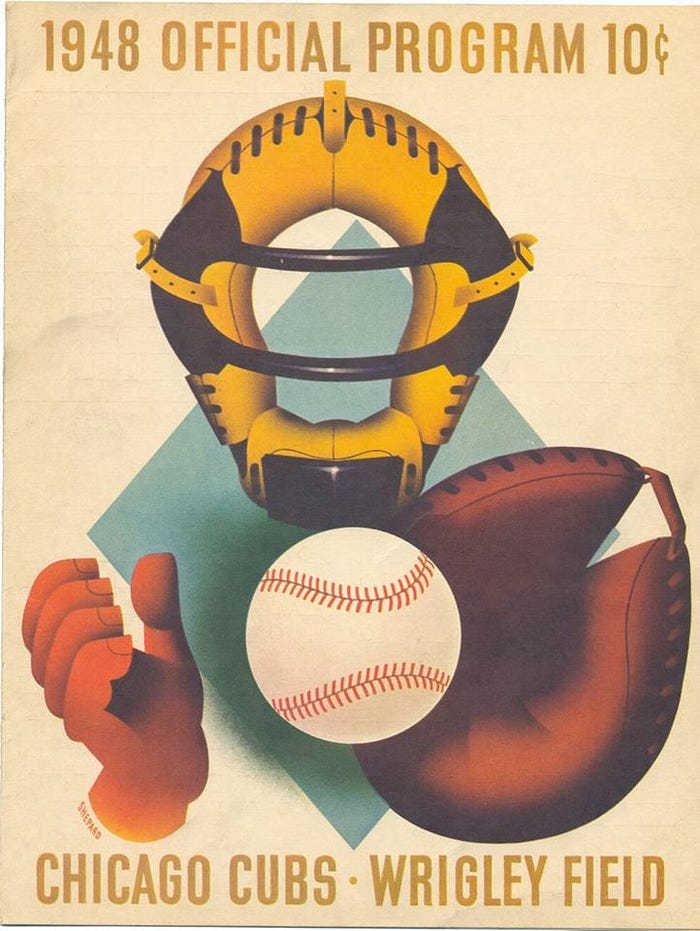
For me, the image on the 1948 scorecard below evokes Magritte and is my favorite.
A 2014 book, Dorothy and Otis: Designing the American Dream, is a splendid tribute (http://www.dorothyandotis.com/).